htmxRazor v2.0.0: Platform and DX
- Chris Woodruff
- April 14, 2026
- htmx
- .NET, asp.net core, C#, dotnet, htmx, htmxRazor, programming
- 0 Comments
An interactive playground, a live theme builder, SignalR, and a Kanban board, all on .NET 10 with no breaking changes.
htmxRazor v2.0.0 is out today. The six features in this release span three distinct areas: developer tooling in your editor, interactive features on the demo site, and two new library components. This is the first major version since the initial release, and each item targets a specific friction point in the experience of building server-rendered ASP.NET Core apps with htmx.
You can find the NuGet package details here.
CSS Anchor Positioning
Four components — tooltip, popover, popup, and dropdown — now use the CSS Anchor Positioning API in browsers that support it (Chrome 125+, Edge 125+). In all other browsers, the existing rhx-position.js engine fires automatically. Nothing changes for users on Firefox or Safari; the fallback is identical to current behavior.
The design avoids static anchor names, which collide when multiple component instances appear on the same page. Instead, RHX.applyCssAnchorPositioning() generates unique --rhx-anchor-* names per instance. Flip behavior moves from JavaScript detection to CSS position-try-fallbacks: flip-block, flip-inline. Arrow elements remain JS-managed, since the CSS Anchor Positioning API does not handle them.
This is a purely additive change. No Tag Helper attributes changed. No existing tests required modification.
Interactive Component Playground
Every component demo page can now host a live property toggle panel. Change variant, size, or state via dropdowns and checkboxes; htmx posts the updated props to the server and re-renders the component preview with the new markup. URL state updates on each change, so any configuration is shareable with a link.
Below the preview, the generated Razor markup appears as a copyable code block.
v2.0.0 ships the Button playground as the reference implementation. The PlaygroundProperty model and shared _PlaygroundPanel.cshtml partial are reusable, so the remaining components can be wired up incrementally following the same pattern.
Theme Builder
The Theme Builder page on htmxRazor.com lets you adjust CSS design tokens — colors, spacing, border radius, typography — and watch the changes applied to a live component preview in real time. When the configuration is right, download a complete CSS file with your custom token values ready to drop into your project.
The builder exposes the --rhx-* token layer. Changing palette colors does not automatically update semantic tokens; that relationship is documented in an inline callout on the page. Semantic tokens must be adjusted independently when you need the full cascade.
SignalR Hub Connector
<rhx-signalr hub-url="/chatHub"
             event-name="ReceiveMessage"
             target="#messages"
             swap="beforeend" />
The <rhx-signalr> Tag Helper connects to an ASP.NET Core SignalR hub and pushes received messages into a target element via htmx swap semantics. No client-side JavaScript is required in your Razor pages beyond loading the @microsoft/signalr client library.
The helper emits a <div> with data-rhx-signalr attributes. The rhx-signalr.js module opens the connection and on each hub event calls htmx.process() on the inserted HTML, preserving htmx processing for any elements in the server response.
SignalR is built into Microsoft.AspNetCore.App. No new NuGet dependencies are introduced.
The demo page ships a live clock and a minimal chat, both driven by a single DemoHub with a hosted background service. 15 unit tests cover the Tag Helper output.
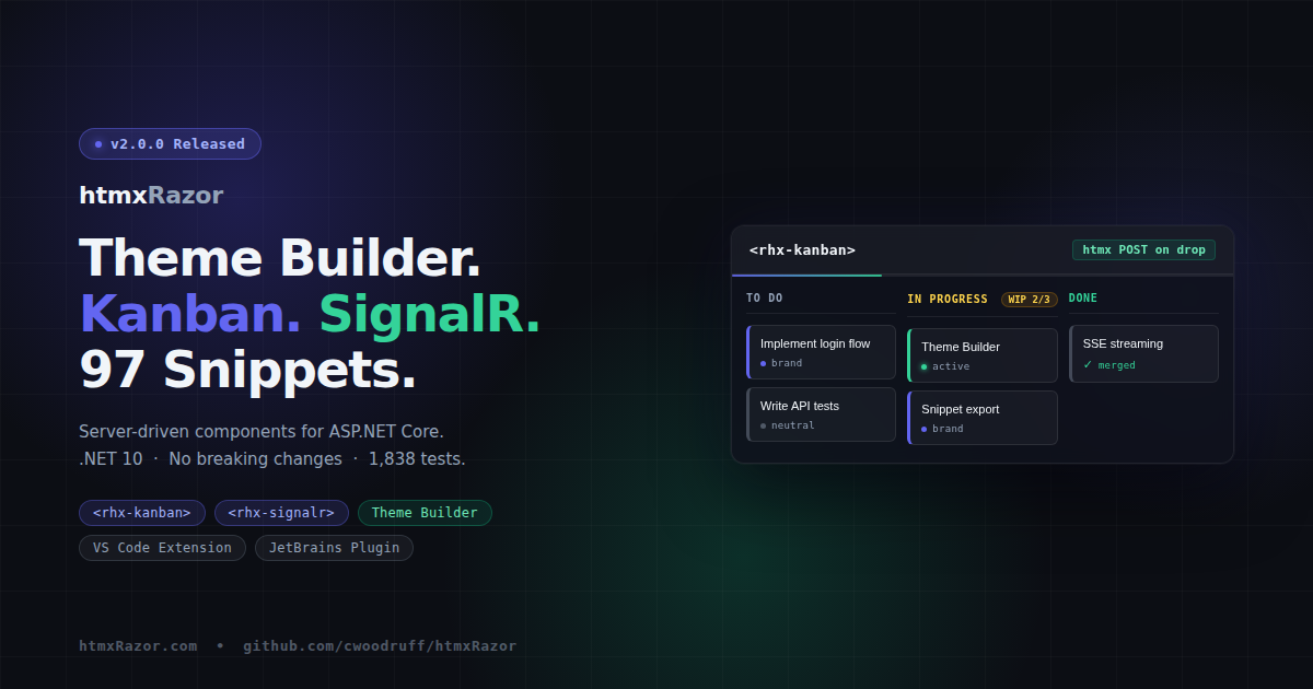
Kanban Board
<rhx-kanban id="board">
  <rhx-kanban-column column-id="todo" title="To Do" max-cards="5">
    <rhx-kanban-card card-id="task-1" variant="brand">
      Implement login flow
    </rhx-kanban-card>
  </rhx-kanban-column>
</rhx-kanban>
The Kanban family provides three Tag Helpers: <rhx-kanban>, <rhx-kanban-column>, and <rhx-kanban-card>. Cards are draggable via HTML Drag and Drop. On drop, an htmx POST fires with the card ID, source column, target column, and calculated insert position. The server controls all state.
Keyboard navigation runs independently of mouse drag: Tab to focus, Enter or Space to grab, arrow keys to move between columns or reorder within a column, Enter or Space again to drop. This provides an accessible path on touch devices, where HTML DnD does not fire.
WIP limits are enforced via max-cards on the column Tag Helper. Exceeding the limit applies a danger border and altered header background.
21 unit tests cover the three Tag Helpers. The demo ships a 3-column board with 6 sample tasks and a reset button.
Test Count
v2.0.0 adds 36 new tests. The running total is 1,838.
Targets .NET 10. No Breaking Changes.
Every change is additive. New components are new APIs. Snippet extensions are new artifacts. The CSS Anchor Positioning work lives entirely inside @supports blocks. Existing apps install the new NuGet package and continue working without modification.
Related Posts