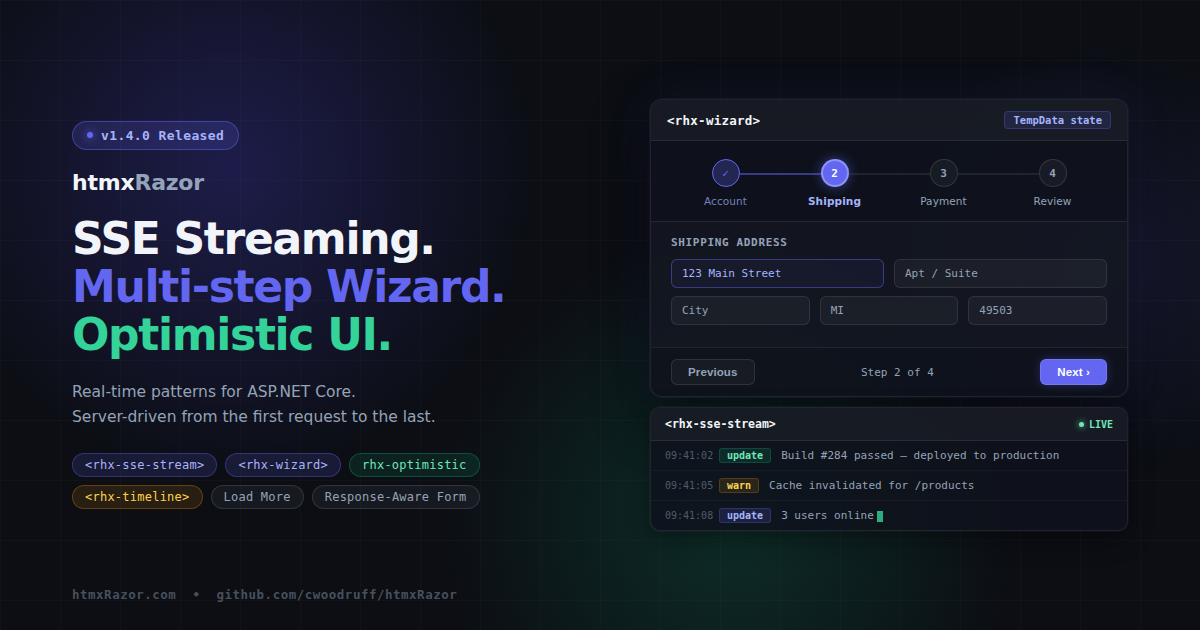
htmxRazor v1.4.0: SSE Streaming, Multi-step Wizard, and Optimistic UI
- Chris Woodruff
- March 24, 2026
- htmx
- .NET, asp.net core, C#, dotnet, htmx, htmxRazor, programming
- 0 Comments
v1.4.0 ships today with seven features built around a single theme: the interaction patterns real production applications actually need. Real-time content streaming, multi-step workflows, immediate UI feedback, response-aware forms, and a handful of targeted quality-of-life additions.
SSE Stream
<rhx-sse-stream> wraps the htmx SSE extension declaratively. One Tag Helper, one server endpoint, no boilerplate:
<rhx-sse-stream rhx-url="/stream" rhx-event="update" />
The component renders with hx-ext="sse", sse-connect, sse-swap, aria-live="polite", and aria-atomic="false" — the full SSE setup in a single line of Razor markup.
Three extension methods on HttpResponse handle the server side:
PrepareSseResponse()— sets Content-Type, Cache-Control, and Connection headersWriteSseEventAsync()— writes a single named SSE eventWriteSseStreamAsync()— streams anIAsyncEnumerable<string>, flushing after each event
public async Task OnGetStream()
{
    Response.PrepareSseResponse();
    await Response.WriteSseStreamAsync(GetUpdatesAsync(), "update");
}

private async IAsyncEnumerable<string> GetUpdatesAsync()
{
    for (int i = 0; i < 10; i++)
    {
        yield return $"<p>Update {i}</p>";
        await Task.Delay(1000);
    }
}
The handler yields HTML fragments. htmx receives them and swaps into the target element. The server side stays idiomatic — IAsyncEnumerable rather than a custom streaming abstraction. htmx 2.x ships SSE as a core extension, so no additional NuGet dependency is required.
Multi-step Wizard
<rhx-wizard> and <rhx-wizard-step> give you a visual stepper with server-side state persistence through TempData. Steps declare inline using the same child-helper registration pattern as the data table:
<rhx-wizard rhx-current-step="2" page="/checkout" rhx-layout="horizontal">
    <rhx-wizard-step rhx-title="Account" rhx-status="complete" />
    <rhx-wizard-step rhx-title="Shipping" rhx-status="current" />
    <rhx-wizard-step rhx-title="Payment" rhx-status="incomplete" />
    <rhx-wizard-step rhx-title="Review" rhx-status="incomplete" />
</rhx-wizard>
WizardState tracks current step, total steps, and which steps are complete. WizardSessionExtensions provides GetWizardState and SetWizardState, which persist and retrieve state through TempData. Wizard progress survives redirects without custom session infrastructure:
public IActionResult OnPostWizardNext()
{
    var state = TempData.GetWizardState("checkout");
    state.MarkComplete(state.CurrentStep);
    state.CurrentStep++;
    TempData.SetWizardState("checkout", state);
    return RedirectToPage();
}
The stepper renders as a <nav> with role="list" on the step container and aria-current="step" on the active item. Keyboard navigation follows the roving tabindex pattern — arrow keys move between step indicators. The rhx-linear attribute (default true) enforces sequential step completion and prevents skipping.
One deployment note: the default cookie-based TempData provider works without any additional configuration. For distributed deployments behind a load balancer, configure a distributed TempData provider to share state across instances.
Timeline
<rhx-timeline>, <rhx-timeline-item>, and <rhx-timeline-icon> cover audit logs, activity feeds, deployment histories, and any other ordered event sequence:
<rhx-timeline rhx-align="start">
    <rhx-timeline-item rhx-variant="success" rhx-label="Today" rhx-active>
        <rhx-timeline-icon>
            <rhx-icon rhx-name="check-circle" rhx-size="16" />
        </rhx-timeline-icon>
        Deployment completed
    </rhx-timeline-item>
    <rhx-timeline-item rhx-variant="warning" rhx-label="Yesterday">
        Build warnings detected
    </rhx-timeline-item>
</rhx-timeline>
Items carry a rhx-variant attribute for connector color: neutral, brand, success, warning, or danger. The rhx-active attribute marks the current item with a highlight ring and aria-current="step". Custom icons slot into the dot via <rhx-timeline-icon>. Layout supports vertical, horizontal, and alternate alignment. The entire connector, dot, and content region are CSS-driven — no JavaScript.
Response-Aware Form
<rhx-htmx-form> eliminates the boilerplate every htmx form currently requires: manually adding hx-ext="response-targets", writing per-status-code target selectors, disabling submit buttons during requests, and managing error container visibility.
<rhx-htmx-form page="/contact" page-handler="Submit"
    rhx-target-422="#errors"
    rhx-error-target="#errors"
    rhx-disable-on-submit
    rhx-reset-on-success>
    <!-- form fields -->
    <div id="errors" aria-live="polite" hidden></div>
</rhx-htmx-form>
The rhx-error-target shorthand sets the 422, 4xx, and 5xx targets to the same selector. Individual rhx-target-422, rhx-target-4xx, and rhx-target-5xx attributes are available for different error destinations per status range.
One note: the response-targets htmx extension must be loaded separately by the host application. The Tag Helper sets hx-ext="response-targets" but does not bundle the extension JS. This follows the standard htmx extension loading model — htmxRazor wires the attributes, the host app controls which extensions are present.
Optimistic UI
rhx-optimistic="true" is now available on <rhx-button>, <rhx-switch>, and <rhx-rating>. Each component reflects state changes immediately on click before the server responds. On error, it reverts automatically.
<rhx-switch rhx-label="Notifications" rhx-checked="true"
            rhx-optimistic
            hx-post="/settings/notifications" />
Per component:
- Button: shows a loading spinner immediately on click, removes it on request completion
- Switch: toggles visual state immediately, reverts on
htmx:responseError - Rating: updates star count immediately, reverts to the saved value on error
The revert animation applies rhx-optimistic--reverted for 600ms. It is suppressed when prefers-reduced-motion: reduce is set. State saving and revert logic live in rhx-optimistic.js, which re-initializes after htmx:afterSettle for dynamically inserted content.
Load More
<rhx-load-more> is a button-triggered pagination pattern for content feeds and list views. Simpler than infinite scroll, more explicit than full pagination controls:
```
<rhx-load-more page="/feed" page-handler="LoadMore"
    route-page="2"
    target="#feed-list"
    swap="beforeend" />
```
The button appends fetched content to the target and removes itself via hx-on::after-request. No cleanup required. The pattern chains naturally by pointing successive calls at incrementing page route values.
Dialog Size Variants
<rhx-dialog> now accepts rhx-size: small (24rem), medium (32rem), large (48rem), full (90vw), or any CSS width value such as 600px or 80%. Custom values set a --rhx-dialog-width CSS custom property via inline style.
The default dialog max-width increases from 32rem to 48rem. Existing dialogs may render slightly wider if their content fills the available space. Restore the previous behavior with rhx-size="medium".
Test coverage
v1.4.0 adds 147 tests across all new and modified components, bringing the library total to 1,802. All changes are additive. No breaking changes. No new NuGet dependencies.
Install
dotnet add package htmxRazor
Full changelog, API docs, and live demos at https://htmxRazor.com.
Source at https://github.com/cwoodruff/htmxRazor.
Related Posts