htmxRazor v1.3.0: Data Table, Accessibility, and Modern CSS
- Chris Woodruff
- March 15, 2026
- htmx
- .NET, asp.net core, C#, dotnet, programming
- 0 Comments
v1.3.0 lands today with six features organized around a clear theme: production patterns for .NET developers building server-rendered UIs that work correctly for everyone, including keyboard users and screen reader users.
Here is what shipped.
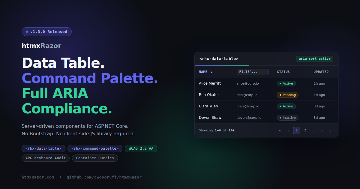
Data Table
The data table is the feature request I hear most from .NET developers evaluating htmx. Until now there was no MIT-licensed ASP.NET Core Tag Helper solution for this pattern. v1.3.0 changes that.
Three Tag Helpers compose the component:
<rhx-data-table>– the wrapper; handles loading state, sticky header, and ARIA attributes<rhx-column>– child helper that registers column definitions: field, header text, sortable, filterable, width, and alignment<rhx-data-table-pagination>– pagination controls that slot directly into the table via the same slot pattern used by<rhx-dialog-footer>
Sort and filter interactions emit hx-get requests and the server returns <tbody> partials. A new DataTableRequest model binder picks the sort field, direction, page number, page size, and filter values off the query string so handler code stays readable:
public IActionResult OnGetTableData(DataTableRequest request)
{
    var query = _db.Products.AsNoTracking();

    if (!string.IsNullOrEmpty(request.Sort))
        query = request.SortDirection == "desc"
            ? query.OrderByDescending(e => EF.Property<object>(e, request.Sort))
            : query.OrderBy(e => EF.Property<object>(e, request.Sort));

    var items = query
        .Skip((request.Page - 1) * request.PageSize)
        .Take(request.PageSize)
        .ToList();

    return Partial("_ProductTableBody", items);
}
Column declarations live inline in markup:
<rhx-data-table rhx-label="Products" rhx-striped rhx-hoverable rhx-sticky-header>
    <rhx-column rhx-field="Name" rhx-header="Name" rhx-sortable />
    <rhx-column rhx-field="Email" rhx-header="Email" rhx-filterable />
    <rhx-column rhx-field="Status" rhx-header="Status" rhx-width="120px" />
    <rhx-data-table-pagination
        rhx-page="1"
        rhx-page-size="10"
        rhx-total-items="142"
        rhx-url="/data" />
</rhx-data-table>
Every sort button is a native <button>. Every sortable column carries aria-sort. Every filter input includes aria-label. The table renders with role="grid" and a proper <caption>. The loading state toggles aria-busy on the container. This is how it should be built from the start.
One note on security: the DataTableRequest model binder accepts any string value for the Sort field. Your handler should validate that value against an allow-list of known property names before passing it to EF.Property<>. The demo page shows this pattern.
Focus Management After Swaps
WCAG 2.4.3 requires that dynamic content changes move keyboard focus to a predictable location. When htmx swaps content, focus stays wherever it was before the swap, which may now point at a removed element. That strands keyboard users with no indication that anything changed.
v1.3.0 ships rhx-focus-swap.js and adds rhx-focus-after-swap to the base Tag Helper class, making it available on any component:
<div rhx-focus-after-swap="first" hx-get="/load-results" hx-target="#results">
    Load
</div>
Three special values:
"first"— focus the first focusable element within the swapped content"self"— focus the element itself"none"— explicitly opt out
Dialog and Drawer Tag Helpers default to "first" without any configuration required. Focus fires via requestAnimationFrame to let the DOM settle before the call.
Command Palette
<rhx-command-palette> opens on Cmd+K (Mac) or Ctrl+K (Windows/Linux), fires a debounced hx-get to a search endpoint, and renders entirely server-provided results. Keyboard navigation uses arrow keys to move through items, Enter to select, and Escape to close and return focus to the trigger element.
<rhx-command-palette
    hx-get="/search"
    rhx-placeholder="Search commands..."
    rhx-debounce="300"
    rhx-min-chars="1" />
Results group server-side with <rhx-command-group> and <rhx-command-item>. The search input carries the full ARIA combobox pattern: role="combobox", aria-expanded, aria-controls, and aria-autocomplete="list". The panel itself is role="dialog" with aria-modal="true". There is no client-side state management for the result list — the server owns that entirely.
Container Queries
The card, dialog, split panel, and data table components now adapt to their container width using @container queries. Components respond to the space they occupy, not the viewport. This matters most in dashboard and sidebar layouts where the same component might sit inside a full-width section or a 280px sidebar column.
/* Before */
@media (max-width: 480px) {
  .rhx-card__image { display: none; }
}

/* After */
@container (max-width: 480px) {
  .rhx-card__image { display: none; }
}
No Tag Helper changes. No configuration. Container query support lands in Chrome 105+, Firefox 110+, and Safari 16+, which covers the full modern browser surface for a .NET 10 audience.
Skip Nav and Landmarks
Two new Tag Helpers for page-level accessibility, addressing WCAG 2.4.1 (Bypass Blocks):
<rhx-skip-nav> renders a visually hidden link that becomes visible on focus and jumps keyboard users past navigation to a configurable target.
<rhx-landmark> wraps content in the correct semantic landmark element with a proper aria-label: main, nav, aside, header, footer, section, search, or form.
Both components are small in surface area but foundational for any application that needs to pass a WCAG audit.
APG Keyboard Audit
All four existing interactive components were audited against the W3C ARIA Authoring Practices Guide keyboard patterns. The components covered: Tabs, Tree, Dropdown, and Combobox. The gaps found and closed:
- Type-ahead search in Tree and Dropdown
HomeandEndkey support in DropdownAlt+ArrowDownandAlt+ArrowUppatterns in Combobox- Missing
aria-expanded,aria-haspopup, and role attributes across components
A shared type-ahead utility now lives in rhx-core.js for use across components. The patterns from this audit carry directly into the new Data Table and Command Palette keyboard implementations.
A note on the European Accessibility Act
The European Accessibility Act took effect in June 2025, making WCAG 2.2 AA a legal requirement for digital products sold in EU markets. The accessibility work in v1.3.0 is not decoration. Components ship with correct ARIA semantics, keyboard navigation, and focus management because that is what the standard requires and what users depend on.
Install
dotnet add package htmxRazor
Full changelog, API docs, and live demos at htmxRazor.com. Source at github.com/cwoodruff/htmxRazor.
Related Posts